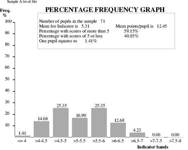
The GCSE mean grade ranges are shown along the x axis with the percentage frequency shown on the y axis. The figures above each column are the percentage frequency for each column.
The larger the sample population (number of pupils) the more likely the graph is to show an approximately normal distribution curve. With small populations the graph can be particularly useful in showing the spread of ability within a given group.
There may be quite marked differences in the distribution of ability between two groups even though the ability means for the two groups, as judged by GCSE mean grades, are nearly the same.
Separate graphs can be produced according to gender, particularly useful when looking at gender differences in examination outcomes.
For more information about this site, Tel. 01963 34128 or E-mail: info@bstubbs.co.uk
SPA Home page
Further A-level analyses
GCSE analyses